

SCP-007: Analyzing the Enigmatic Entity Through an Artistic Lens
Exploring the Psychology of Color in Painting
The Influence of Color on Emotions and Behavior
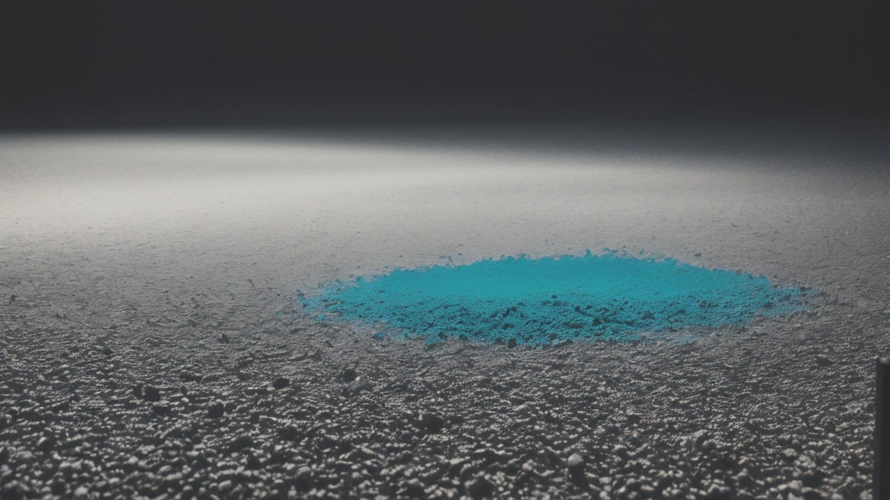
Colors play a big role in how we feel and act. Artists use this to make their work powerful. Red can make us feel excited or angry. Blue often makes us feel calm or sad. Green might make us think of nature and peace. Yellow can make us feel happy or anxious.
When artists choose colors, they think about these effects. They might use warm colors like red and orange to create energy. Cool colors like blue and purple can make a scene feel calm. The mix of colors can change the whole mood of a painting.
Color can also affect how we behave. Some colors make us more alert. Others might help us relax. Artists use this in their work. They might paint a room in calm colors to help people feel at ease. Or they might use bright colors to grab attention in a public space.
The Impact of Color on Perceived Artistic Value
The colors in a painting can change how valuable people think it is. Some color combos look fancy or special. Gold and purple often seem royal or expensive. Using these might make a painting seem more valuable. Rare colors can also make art seem special.
How an artist uses color can show their skill. Complex color mixing might make a painting seem more impressive. People might think the artist is very good. But simple colors can be powerful too if used well. It's all about how the artist uses them to create an effect.
Color trends can also affect value. Some colors become popular at certain times. Art that uses these colors might seem more current and valuable. But timeless color schemes can also make art seem valuable for a long time.
The Role of Color Theory in Painting Techniques
Selecting the Right Palette for Your Work
Choosing colors is a key part of painting. Artists often start with a color scheme. This is a plan for which colors to use together. There are several types of color schemes:

- Complementary: Uses colors opposite on the color wheel
- Analogous: Uses colors next to each other on the wheel
- Monochromatic: Uses different shades of one color
- Triadic: Uses three colors evenly spaced on the wheel
Artists pick a scheme based on what they want to say. A complementary scheme might create energy. An analogous scheme might create harmony. The choice depends on the painting's mood and message.
Artists also think about what colors mean in different cultures. This helps them choose colors that send the right message. They might avoid colors that have negative meanings in some places.
The Use of Color Tones and Shades to Enhance Drama
Artists use different versions of colors to add depth to their work. They might make a color lighter or darker. This can make some parts of the painting stand out. It can also create a sense of distance or mood.
Here are some ways artists use color to add drama:
- Contrast: Using light and dark colors to create focus
- Gradients: Slowly changing from one color to another
- Temperature: Using warm and cool colors to show depth
For example, a dark background can make light objects pop out. Slowly changing from light to dark can make things look far away. Using warm colors in front and cool colors behind can create depth. These tricks help guide the viewer's eye through the painting.
Advanced Color Manipulation for Painters
The Application of Color Science in Digital Media and Printmaking
Digital tools have changed how artists work with color. Computer programs let artists try out different colors quickly. They can change colors with just a click. This makes it easy to experiment with many color options.
In digital art, artists can:
- Adjust brightness and contrast
- Change the warmth or coolness of colors
- Mix colors in ways not possible with real paint
For printing art, understanding how colors mix is important. Artists need to know how colors will look when printed. They might use special techniques to create new colors by layering. Digital tools help make sure colors look the same in print as they do on screen.
Color management systems help keep colors consistent. This is key when art moves from screen to print. Artists can use these tools to make sure their work looks right in different media.
Case Studies: Successful Color Strategies in Contemporary Art
Many modern artists are known for how they use color. Let's look at some examples:
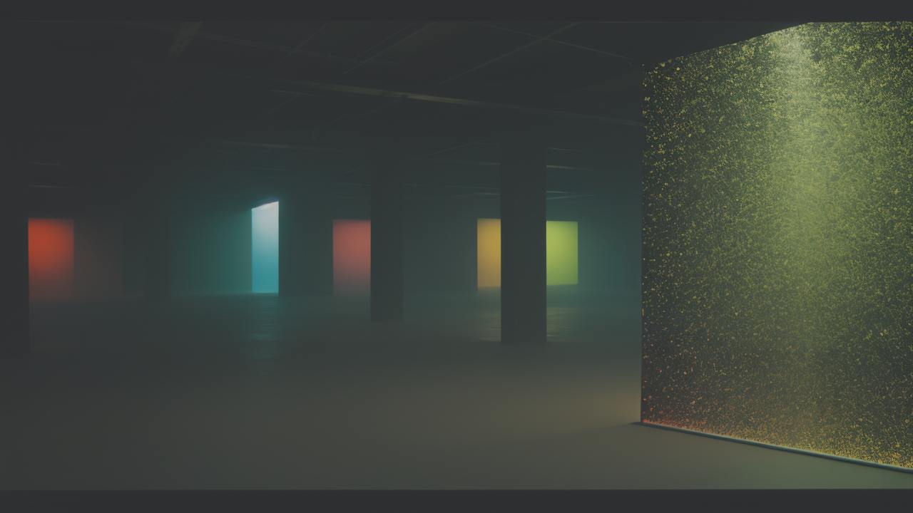
- Yayoi Kusama: She often uses one color in her art installations. Her "Infinity Rooms" use repeating patterns of a single color. This makes her work very striking and memorable.
- James Turrell: He creates art with light. He uses subtle color changes to alter how we see space. His work shows how small color shifts can have big effects.
- Mark Rothko: He painted large blocks of color. The way he layered colors created deep, emotional effects. His work shows how simple color use can be powerful.
- Gerhard Richter: He experiments with color in abstract paintings. He often uses bright, clashing colors to create energy and movement.
These artists show different ways to use color effectively. Some use bold, simple colors. Others use complex color relationships. Their work proves that understanding color is key to making impactful art.
In conclusion, mastering color is crucial for painters. It involves understanding how colors affect emotions and value. Artists must choose the right palette and use color to create depth. New digital tools offer more ways to work with color. By studying successful artists, we can learn to use color more effectively in our own work.

