

Unleashing Creativity: The Power of Pop Art and Colorful Abstract Paintings
The Resurgence of Pop Art in the Modern United States
The Historical Context of Pop Art
Pop art burst onto the scene in the 1950s and 60s. It was a bold reaction to abstract expressionism. Artists like Andy Warhol and Roy Lichtenstein led the charge. They drew inspiration from popular culture and mass media. Pop art challenged the notion of 'high art'. It embraced everyday objects and icons.

The movement reflected the post-war consumer boom. It captured the spirit of a changing society. Pop art was accessible and relatable. It spoke to a wider audience. The bright colors and familiar images struck a chord. Pop art became a mirror of American culture.
How Pop Art Influences Contemporary Culture
Pop art's influence is still strong today. It shapes our visual landscape. We see it in advertising, fashion, and design. Pop art's bold style catches the eye. It makes messages more memorable. Many brands use pop art elements in their campaigns.
Social media has given pop art new life. Its eye-catching nature works well online. Artists create digital pop art for the internet age. Pop art's themes of consumerism remain relevant. It continues to comment on our consumer-driven society.
Movies and TV shows often use pop art aesthetics. It adds a cool, retro vibe to productions. Pop art has become a shorthand for 'hip' and 'trendy'. Its influence extends beyond visual arts. It shapes music videos, album covers, and stage designs.
Key Factors Behind the Rising Popularity of Pop Art
Several factors drive pop art's renewed popularity. Nostalgia plays a big role. People are drawn to the retro feel of pop art. It reminds them of simpler times. The bold, cheerful style offers an escape from today's complexities.
Pop art's simplicity appeals to many. In a world of information overload, it cuts through the noise. Its clear messages and striking visuals stand out. This makes it perfect for the fast-paced digital age. Pop art works well on small screens and in brief attention spans.
The DIY movement has also boosted pop art. Its techniques are often easy to replicate. This makes it accessible to amateur artists. Many people enjoy creating their own pop art. Social media platforms showcase these creations. This further spreads pop art's influence.
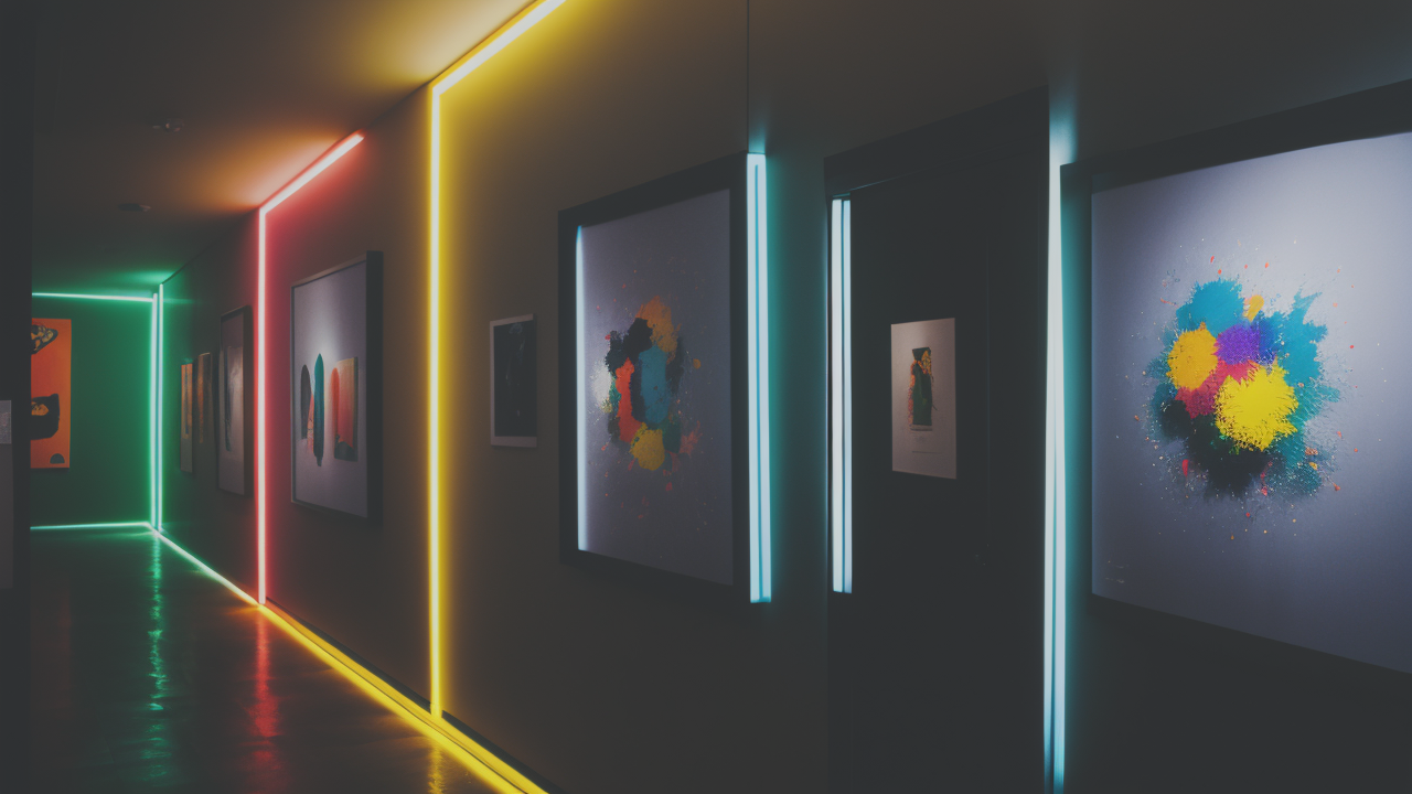
Colorful Abstract Paintings: A New Frontier in Artistic Expression
The Role of Color Psychology in Pop Art
Color is a powerful tool in pop art. It evokes emotions and sets the mood. Bright, bold colors are a hallmark of the style. They grab attention and create energy. Each color carries its own psychological impact. Red might signify passion or urgency. Yellow often represents happiness or optimism.
Pop artists use color psychology to their advantage. They choose colors that reinforce their message. The contrast between colors can create visual interest. It can also highlight certain elements of the work. Color combinations can evoke specific eras or cultural references.
Understanding color psychology helps artists communicate better. They can guide the viewer's emotional response. This makes the art more impactful and memorable. Color choices can make or break a pop art piece. It's a crucial aspect of the genre.
The Intersection of Pop Art and Colorful Paintings
Pop art and colorful paintings often overlap. Both use vibrant hues to make a statement. Pop art typically features flat, bold colors. Abstract paintings might use more nuanced color blending. Yet both styles celebrate the power of color. They use it to evoke emotions and capture attention.
Many artists combine pop art elements with abstract techniques. This creates a fresh, hybrid style. They might use pop art's bold outlines but fill them with abstract color fields. Or they could take abstract shapes and give them pop art's bright, solid colors.
This intersection allows for exciting new expressions. It bridges the gap between two distinct styles. The result is often visually striking and thought-provoking. It appeals to fans of both pop art and abstract expressionism.
Pioneers of the Colorful Paintings Movement
Several artists have led the way in colorful paintings. Wassily Kandinsky was an early pioneer. He explored the emotional impact of color in abstract forms. His work laid the foundation for many who followed. Mark Rothko created large color field paintings. These evoked deep emotional responses through color alone.
In pop art, Andy Warhol's colorful prints of celebrities became iconic. Roy Lichtenstein used bright colors in his comic book-inspired works. These artists showed how color could be a subject in itself. They pushed the boundaries of what art could be.
Today, artists like Yayoi Kusama continue this tradition. Her bright, polka-dotted installations are instantly recognizable. Jeff Koons uses vibrant colors in his pop art sculptures. These artists keep the spirit of colorful expression alive. They inspire new generations to explore the power of color.
Implementing Pop Art Strategies in Your Creative Projects
Leveraging Pop Art for Branding and Identity
Pop art can be a powerful tool for branding. Its bold style makes logos and designs stand out. Many companies use pop art elements in their visual identity. This creates a fun, youthful image. It can help a brand seem more approachable and dynamic.

When using pop art for branding, consistency is key. Choose a color palette that reflects your brand values. Use simple, recognizable imagery. This could be icons related to your industry. Or it could be stylized versions of your products. The goal is to create a memorable visual language.
Pop art can work well across different media. From business cards to billboards, its style scales easily. This helps create a cohesive brand experience. Remember to balance creativity with clarity. Your brand message should still come through clearly.
Tips for Integrating Colorful Paintings into Your Design Work
Incorporating colorful paintings into design can add depth and interest. Start by choosing a color scheme that fits your project's mood. Use color theory to create harmonious or contrasting effects. Don't be afraid of bold choices, but ensure they serve your overall goals.
Consider using abstract elements as backgrounds or textures. These can add visual interest without overwhelming other design elements. You can also use colorful paintings as inspiration for your color palette. Extract key colors from a painting to use in your design.
Balance is important when working with colorful elements. Use neutral spaces to give the eye a rest. This can make the colorful areas more impactful. Remember that less can be more. A small pop of color can be just as effective as a large, colorful area.
Case Studies: Successful Pop Art Campaigns
Many brands have successfully used pop art in their campaigns. Coca-Cola's "Share a Coke" campaign used pop art-inspired designs. They featured personalized names on bottles in a bold, graphic style. This created a fun, interactive experience for consumers.
Adobe's "Make It" campaign used bright colors and simple shapes. It showcased the creative potential of their software. The pop art style made complex concepts feel accessible and exciting. This appealed to both professional and amateur creators.
MTV's rebranding in 2015 embraced pop art aesthetics. They used bold colors and simple animations. This helped them connect with a younger audience. It also nodded to their cultural heritage. These campaigns show how pop art can refresh a brand's image and engage audiences in new ways.

