

The Psychology of Color: Creating Vibrant and Emotive Paintings
Understanding the Impact of Color on Mood and Behavior
The Fundamentals of Color Psychology
Color psychology is a fascinating field that explores how colors affect our emotions and behavior. It's key to creating art that resonates with viewers. Different hues can evoke various feelings and reactions.
Red often signifies passion or danger. Blue can create a sense of calm or trust. Yellow may spark joy or caution. Green is often linked to nature and growth. Purple can suggest luxury or creativity.
Understanding these basics helps artists make informed choices. They can use color to set the tone of their work. This knowledge is crucial for creating paintings that speak to the audience on a deeper level.
How Hues Influence Emotion and Decision Making
Colors play a big role in how we feel and act. They can sway our mood and choices without us even noticing. Warm colors like red and orange can make us feel excited or hungry. Cool colors like blue and green often have a calming effect.
In marketing, companies use color to shape brand perception. For example, many fast-food chains use red and yellow. These colors can increase appetite and create a sense of urgency.
Artists can use this knowledge to guide viewers' emotions. By choosing certain colors, they can influence how people interpret and react to their work. This power of color is a valuable tool in creating impactful art.
Cultural Shifts in Color Perception
Color meanings can vary greatly across cultures. What's seen as lucky in one place might be viewed differently elsewhere. For instance, white represents purity in Western cultures. But in some Eastern cultures, it's associated with mourning.
These perceptions can change over time too. Pink was once seen as a masculine color in the West. Now it's often linked to femininity. Understanding these shifts is crucial for artists working in a global context.
Artists should research cultural meanings when creating for diverse audiences. This awareness helps avoid unintended messages. It also allows for more nuanced and culturally sensitive art.
Strategies for Using Color in Art to Affect the Audience
The Role of Color in Visual Storytelling
Color is a powerful tool in visual storytelling. It can set the mood, highlight key elements, and guide the viewer's eye. Artists use color to create depth, contrast, and harmony in their work.
For example, a painting with mostly cool colors might tell a calm, sad story. Adding a pop of warm color can create a focal point or tension. This contrast can draw attention to important parts of the narrative.
Color can also represent abstract concepts. Red might symbolize love or anger. Blue could represent peace or sadness. By using color thoughtfully, artists can add layers of meaning to their work.
Leveraging Color for Evocation and Memories
Colors have the power to evoke strong emotions and memories. They can transport us to different times and places. Artists can use this to create deeply personal connections with their audience.
For instance, the golden hues of a sunset might remind viewers of warm summer evenings. The deep greens of a forest scene could evoke feelings of peace and connection with nature.
By choosing colors that resonate with common experiences, artists can tap into shared memories. This creates a more immersive and emotional experience for the viewer.
Color Trends in Modern Art
Modern art often pushes the boundaries of traditional color use. Many contemporary artists experiment with bold, unexpected color combinations. Some focus on monochromatic schemes for dramatic effect.
Neon colors have gained popularity in recent years. They add a vibrant, modern feel to artwork. Pastels are also trending, offering a softer, more soothing palette.
Digital art has opened up new possibilities for color use. Artists can now work with colors that aren't possible in traditional mediums. This has led to exciting innovations in color theory and application.
Case Studies of Successful Artistic Color Schemes
Iconic Paintings and Their Color Stories
Many famous paintings are known for their distinctive use of color. Van Gogh's "Starry Night" is a prime example. Its swirling blues and vibrant yellows create a dreamlike, emotional scene.

Picasso's "Blue Period" shows how a limited palette can convey deep emotions. The cool blue tones in these works often evoke feelings of melancholy and introspection.
Monet's water lily paintings demonstrate the power of subtle color variations. His use of light and reflection creates a sense of movement and tranquility.
These iconic works show how color can be central to a painting's impact and meaning.
Analyzing the Effectiveness of Color in Public Art
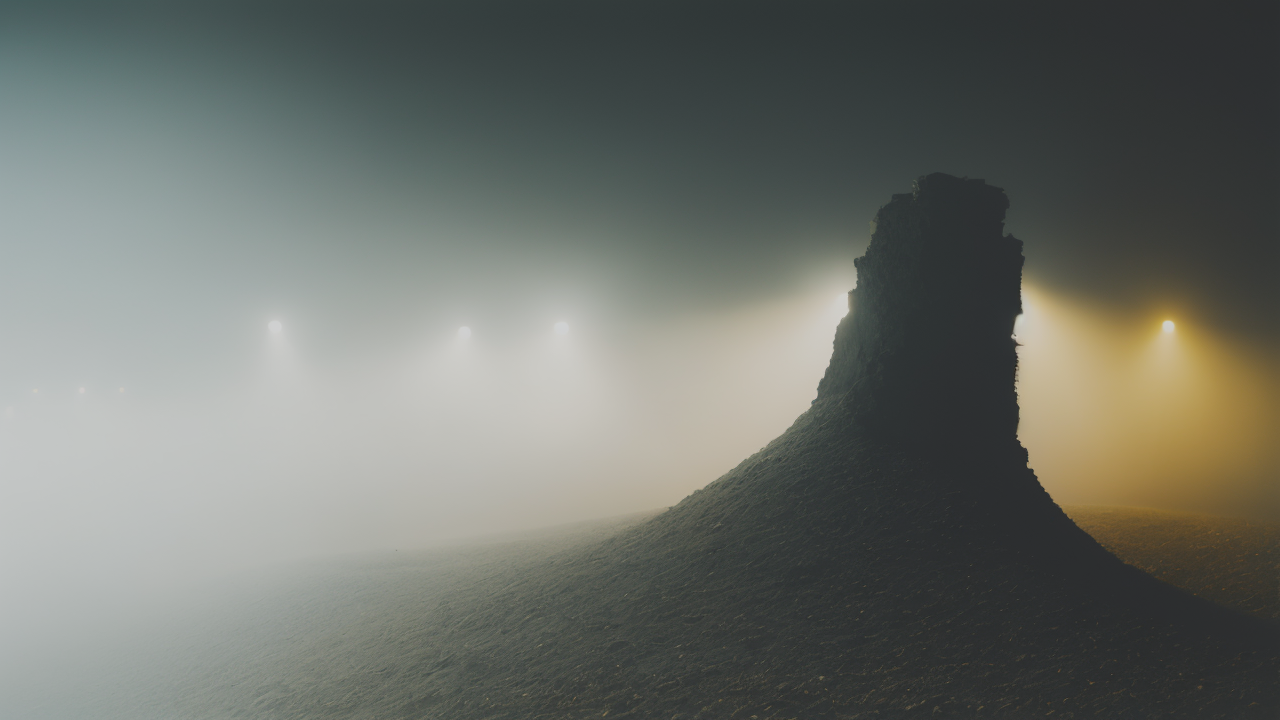
Public art often uses color to grab attention and convey messages. Murals are a great example of this. They can transform urban spaces and create a sense of community.
One famous case is the "Rainbow Tank" in Santa Barbara, California. This colorful installation turned a drab oil tank into a local landmark. Its bright stripes make people smile and spark conversation.
Another example is Christo's "The Gates" in New York's Central Park. The saffron-colored fabric created a warm glow against the winter landscape. It changed how people experienced a familiar space.
These projects show how color in public art can change perceptions and create shared experiences.
How Art Installations Use Color to Enhance User Experience
Interactive art installations often rely heavily on color to engage viewers. They create immersive experiences that stimulate multiple senses.
James Turrell's light installations are a perfect example. He uses colored light to alter perception of space. Viewers often feel like they're stepping into a different world.
Yayoi Kusama's "Infinity Mirror Rooms" use color and light to create mesmerizing spaces. The repeating patterns and changing hues create a sense of endless possibility.
These installations show how color can be used to create transformative art experiences. They invite viewers to explore and interact in new ways.

