

Exploring Color Theory: Elevate Your Painting Skills with Expert Insights
The Psychology of Color in Painting: Harnessing Emotion and Perception
The Impact of Color on Mood and Behavior
Colors have a profound effect on our emotions and actions. Red can evoke passion or anger. Blue often brings calm and trust. Yellow may spark joy and energy. Green is linked to nature and growth.
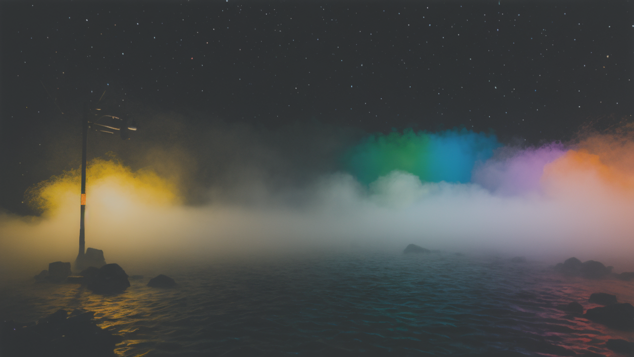
When painting, artists use these effects to create mood. A bright, warm palette can make a scene feel happy and inviting. Cool, muted tones can create a sense of mystery or sadness.
Understanding color psychology helps artists convey feelings. It's a powerful tool for storytelling through art. By choosing colors wisely, painters can guide viewers' emotions.
This knowledge is key for all types of painting. From landscapes to portraits, color sets the tone. It's a silent language that speaks directly to the heart.
Color and Cultural Influences in the United States
In the U.S., colors carry unique meanings shaped by history and culture. Red, white, and blue represent patriotism. These colors appear in many American paintings.
Black is often used for formal or somber themes. It's common in corporate art and serious portraits. White suggests purity and cleanliness. It's popular in minimalist and modern art.
Green is linked to money and prosperity in American culture. It's often used in paintings of wealth or success. Purple has royal or luxurious connotations. It appears in art depicting elegance or power.
Artists in the U.S. use these cultural color meanings to connect with viewers. They can evoke shared experiences or values through color choices. This creates a deeper bond between the art and its audience.
Color and Light: Enhancing Visual Appeal
Light and color are inseparable in painting. The way light hits an object changes its color. This interplay creates depth and realism in art.
Painters use techniques like highlights and shadows to show light's effects. Warm colors can make objects seem closer. Cool colors can push things into the background.
Time of day affects color too. Morning light is cool and blue. Evening light is warm and golden. Artists capture these shifts to set a scene's mood and time.
Reflections and color bounce add complexity to paintings. A red object might cast a pink glow on nearby surfaces. This attention to light and color interaction brings paintings to life.
Advanced Techniques in Color Mixing for Painters
The Science of Color: RGB, CMYK, and Beyond
RGB and CMYK are two key color models in art. RGB (Red, Green, Blue) is used for digital displays. CMYK (Cyan, Magenta, Yellow, Key/Black) is for print.

Painters often work with pigments, which follow subtractive color mixing. This means colors get darker as they mix. It's different from light-based RGB mixing.
Understanding these models helps artists choose and mix colors effectively. They can predict how colors will interact on canvas or screen.
Beyond these basic models, painters explore color spaces like HSL and HSV. These systems offer new ways to think about and manipulate color.
Mastering color science allows painters to achieve precise hues and effects. It's a blend of art and chemistry that elevates painting skills.
Color Harmonies and Combinations: Tips from the Experts
Color harmony creates pleasing visual effects in paintings. Experts recommend several key combinations:
- Complementary colors: Opposite on the color wheel, like blue and orange.
- Analogous colors: Next to each other, such as blue, blue-green, and green.
- Triadic colors: Evenly spaced on the wheel, like red, yellow, and blue.
- Monochromatic: Various shades and tints of one color.
These harmonies create balance and interest in artwork. They guide the viewer's eye and set the overall tone.
Experts advise using a dominant color with accents for contrast. This creates focal points and depth. They also suggest experimenting with intensity and value to add complexity.
Learning these combinations helps painters create cohesive and striking compositions. It's a skill that develops with practice and observation.
The Role of Color Temperature in Painting
Color temperature refers to the warmth or coolness of a color. Warm colors include reds, oranges, and yellows. Cool colors are blues, greens, and purples.
Temperature affects the mood and depth of a painting. Warm colors appear to advance, while cool colors recede. This creates the illusion of space on a flat canvas.
Artists use temperature to guide the viewer's focus. A warm object against a cool background will stand out. Subtle temperature shifts can suggest light direction or time of day.
Mixing warm and cool versions of a color adds richness to paintings. It creates vibrant shadows and highlights. This technique brings life and dimension to artwork.
Understanding color temperature allows painters to create more dynamic and realistic scenes. It's a powerful tool for conveying atmosphere and emotion in art.
Case Studies: Successful Use of Color in Painting
Notable American Painters and Their Color Strategies
American painters have used color in unique ways throughout history. Georgia O'Keeffe is known for her bold, vibrant flowers. She used close-up views and intense colors to capture nature's beauty.
Mark Rothko created large color field paintings. He used layers of color to evoke deep emotions. His work shows how simple color use can be powerful.
Jackson Pollock's drip paintings feature complex color interactions. He layered colors to create depth and movement. This technique revolutionized abstract expressionism.
Wayne Thiebaud is famous for his colorful depictions of everyday objects. He uses shadows with unexpected colors to add vibrancy to simple scenes.
These artists show diverse approaches to color in American painting. Their strategies continue to influence modern artists and color theory.
Analyzing the Success of Color in Modern Art
Modern art often pushes the boundaries of color use. Success in this field often comes from bold choices and new perspectives on color.
Artists like Yayoi Kusama use repetitive patterns of bright colors. This creates immersive experiences that challenge perception. Her work shows how color can transform spaces.
Street artist Banksy uses limited color palettes for impact. Often working in black and white with a pop of color, he draws attention to key elements.
Digital artists explore new frontiers in color. They use technology to create colors not possible in traditional media. This expands the possibilities for color in art.
Successful modern artists often break traditional color rules. They find new ways to evoke emotions and ideas through unexpected color choices.
Learning from the Experts: Color Techniques and Applications
Expert painters share valuable tips for using color effectively:
- Start with a limited palette to master color mixing.
- Use color wheels and charts to plan harmonious combinations.
- Observe color in nature to improve realism in paintings.
- Experiment with different brushstrokes to create texture with color.
- Practice creating depth through careful use of warm and cool tones.
They also emphasize the importance of understanding light's effect on color. Studying how colors change in different lighting conditions improves painting skills.
Experts recommend keeping a color journal. This helps track successful combinations and techniques. It's a valuable tool for growth and experimentation.
Applying these expert techniques can significantly improve a painter's use of color. It leads to more dynamic and impactful artwork.

